Bike signals made better by design
As cities continue to grow their bicycle infrastructure there is a growing need for education about sharing the road, repairing the rift in the bicycle/car relationship and fostering a safe commuting future. Living in Chicago, I’ve seen the city expand its protected bike lanes from our flagship Dearborn route in 2012 to our most recent Washington, Randolph and Clinton lanes. A few of which I ride on to work every day. In the years since Chicago opened the lanes on Dearborn, I’ve noticed a consistent problem regarding traffic signals.
About once a week I’m cut off by a car turning illegally through bicycle-specific signals.
Have a look at the image above. Notice the signal dedicated to bicycle traffic? It’s an independent fixture that works just like your typical stop light (same colors, same height, same shape); however, it runs opposite to turning cars. Bicycles go when cars should be stopped and vice versa. That’s where the confusion begins.
These are intersections where bike traffic must be extremely defensive because driver expectations are completely disrupted. Driver habits are formed over time by dots and arrows, so an unaware driver isn’t going to pay attention to a fancy new bike signal. And the presence of the signal can be a danger to the casual cyclist with a false sense of security.
As a designer and avid cyclist, I decided to turn my skills toward the public good and suggest a way to improve the function and safety of the signal system. The design comes with solving for clarity in this post.
Three Possible Solutions
I’m exploring clarity in three different directions: 1) simplifying the existing bike symbol, 2) introducing a bike-familiar abstract shape and 3) with words.
1. Simplify the symbol
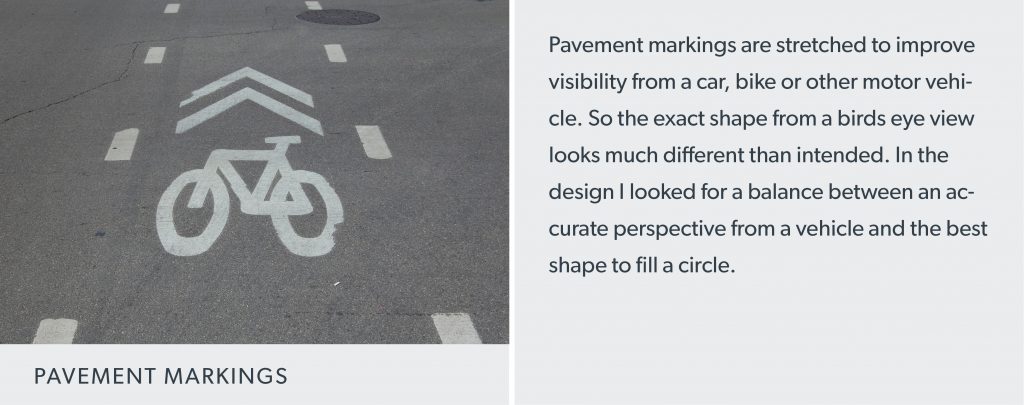
Simplifying the existing symbol seemed like the most logical place to start. There is too much detail in the existing symbol. When backlit, it turns into a blob from a distance. Even the pavement markings incorporate fewer elements.

I stripped out the pedals and top tube to start. Those features don’t make or break our understanding of a bicycle in its simplest form. The geometry of the symbol now allows more space to increase the wheel size. Reduce the seat to a single line and we’ve got a symbol that’s simple, larger, and more legible. These layers of clarity add up when reflected on the white road signs. Take the before, below: As is, the same icon is being used. Great. But for some reason they face in different directions?

2. Introducing an abstract shape
Introducing an abstract shape goes hand in hand with the need for driver’s education. This execution works well under universal adaptation and understanding of its meaning. The slow-moving vehicle sign is a good example of an abstract shape serving its intended purpose.

In this execution, I’ve explored using a bike-familiar symbol already seen in bike lanes at intersections – the double “V”. Although this idea poses a much more nation-wide ideal, there is a nice nod to Chicago in its reference to the Divvy logo.
3. A throwback to the basics
Finally, what about just saying BIKE? It seems to work well for STOP. In execution, the key factor is the right typeface with letterforms that maximize the height within a circle.

Clear, condensed, and intentional — Interstate makes as good a case as any. Designed by Tobias Frere-Jones it’s the same typeface that Michael Bierut chose for NYCs parking signs. We can apply the same logic to the white road signs by leading with BIKE and following with messaging. There is also nice action to the word bike since it’s both a verb and a noun: Don’t drive, bike.
What works?
The exploration, time and attention to detail that made the bike symbol as simple and truthful as possible was the original challenge that I couldn’t resist. And for that, the craftsman in me is drawn to its success. But let’s face it, the bike symbol still doesn’t solve for clarity as well as solution three. The word BIKE would be a huge step in the right direction. These are the decisions that designers make every day, and we should remind ourselves — we are communicators first. To bring it all back to Chicago in this case, Louis Sullivan said it best, “Form follows function.”
Every commuter can make a difference
This is just a small piece of a much larger discussion around bicycle safety. Let’s not forget that education is our greatest advocate in making these signals observed. Beyond driver’s education, we can continue to support organizations like Active Transportation Alliance who’ll help spread the word and keep people informed. Even featuring the symbol on the electronic emergency signs as cars flood into downtown would be a great, low-cost way of using the state’s already existing IDOT infrastructure. Of course, there is always room for grassroots campaigning on cycling and safety. I’ll set that aside as a future challenge to designers, including Simple Truth. Now, wanna go for a ride?
Got a design challenge we can help you solve? Contact us.
Photography: Marcus Norman